


Web app
IoT dashboard for Firestations

role
Product design
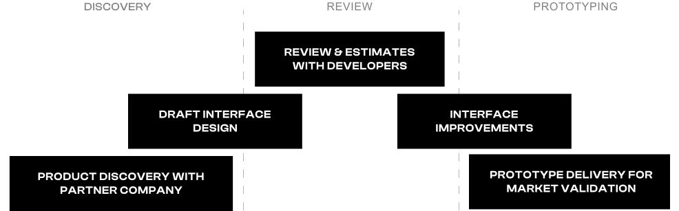
Discovery & workshops
Prototyping (vibe-coded)
what
An IoT product that monitors the gates at fire stations and alerts the station when something goes wrong
why
To verify the idea has real value for the people who'd use it
who
Station manager:
Runs the station day to day and is rarely at a desk. Wherever they are, they want to know whether the gates are closed, whether a door is starting to misbehave, and whether someone got in. Alerts go to their phone.
The city:
Pays for the product and looks after many stations. Works from a desktop and wants a quick overview of every station without digging around.
Technician:
Installs the hardware. Doesn't use the product day to day — needs to connect a gate, check that it works, and move on, one step at a time, while standing at the door.
The problem
Fire station gates are easy to ignore until one fails. Interviews with stations surfaced four problems: nobody knows what condition a door is in, since maintenance follows a fixed schedule rather than actual wear. A gate failing mid-dispatch costs the crew about five minutes — they have to climb out and open it by hand. Equipment gets stolen through gates that open without a command, often at night in stations that are unstaffed or volunteer-run. And there's no way to confirm every door is actually closed.
The process
The challenge
The brief sounded simple: show door status and send alerts. Doing it right meant solving five problems — meeting the needs of different user groups (a manager checking a phone in a hurry vs. the city scanning a dashboard now and then), sending alerts people can act on quickly even though nobody had installed sensors in a fire station yet, and staying focused on what a raw IoT feed — vibration, motor power, opening times — actually means to the person reading it.
Decisions
No door control — for security reasons, we kept it out of the first
version. Workshops with the product team produced a long feature
list, and predictive maintenance was on it — but one point kept
coming up: servicing a door is cheap, so maintenance alone wouldn't
justify a subscription. Security was the stronger reason to buy, so
I designed the core alerts around it:
— Unauthorized access: the door opened without a command from the
controller.
— Door failed to open: a command was sent and nothing moved.
— Entry while closing: someone slipped in as the door came down.
— Door stayed open: a vehicle left and no close command followed —
default one minute, adjustable, since we had no field data to set a
better number.
Maintenance signals sit beside them as metrics: total door cycles,
average opening time, how long doors stay open, vibration and power
use.
Implementation
I designed a scalable monitoring platform that gives station managers a clear overview of vehicle availability, security issues and device health across cities, stations and individual gates. The experience combines intuitive navigation and detailed performance insights with a guided, three-step installation flow that helps technicians configure and connect sensors correctly. Clear status indicators make device issues easy to spot, while station-level team management ensures secure, role-based access. Built on the company's existing component library and day and night design tokens, the solution integrates seamlessly into its product ecosystem and supports future expansion.
Mobile implementation
I designed the experience mobile-first, prioritising the needs of station managers who monitor operations on the move and often under time pressure. The interface brings station and gate statuses into immediate view, while contextual alerts highlight what happened and for how long. By prioritising visibility, clarity and quick decision-making, I made it easier to identify issues and take action without navigating through unnecessary layers.
Mobile implementation
I designed the experience mobile-first, prioritising the needs of station managers who monitor operations on the move and often under time pressure. The interface brings station and gate statuses into immediate view, while contextual alerts highlight what happened and for how long. By prioritising visibility, clarity and quick decision-making, I made it easier to identify issues and take action without navigating through unnecessary layers.
Outcome
I turned the designs into a working prototype myself, building it with Claude, so developers could stay focused on their main project and the product team had something real to show at the conference. Once it was shared, the market response was encouraging — people were interested and ready to test the solution.