app redesign
Facegroovin'
role
User research
Information architecture
product design
Prototyping
what
Facegroovin' application - provides a variety of facial massage guides
why
To help people stay young and beautiful
who
Women/Men:
25 – 65 years. They take care of their face. They want to stay attractive and they want to relax after a busy day.
Current state
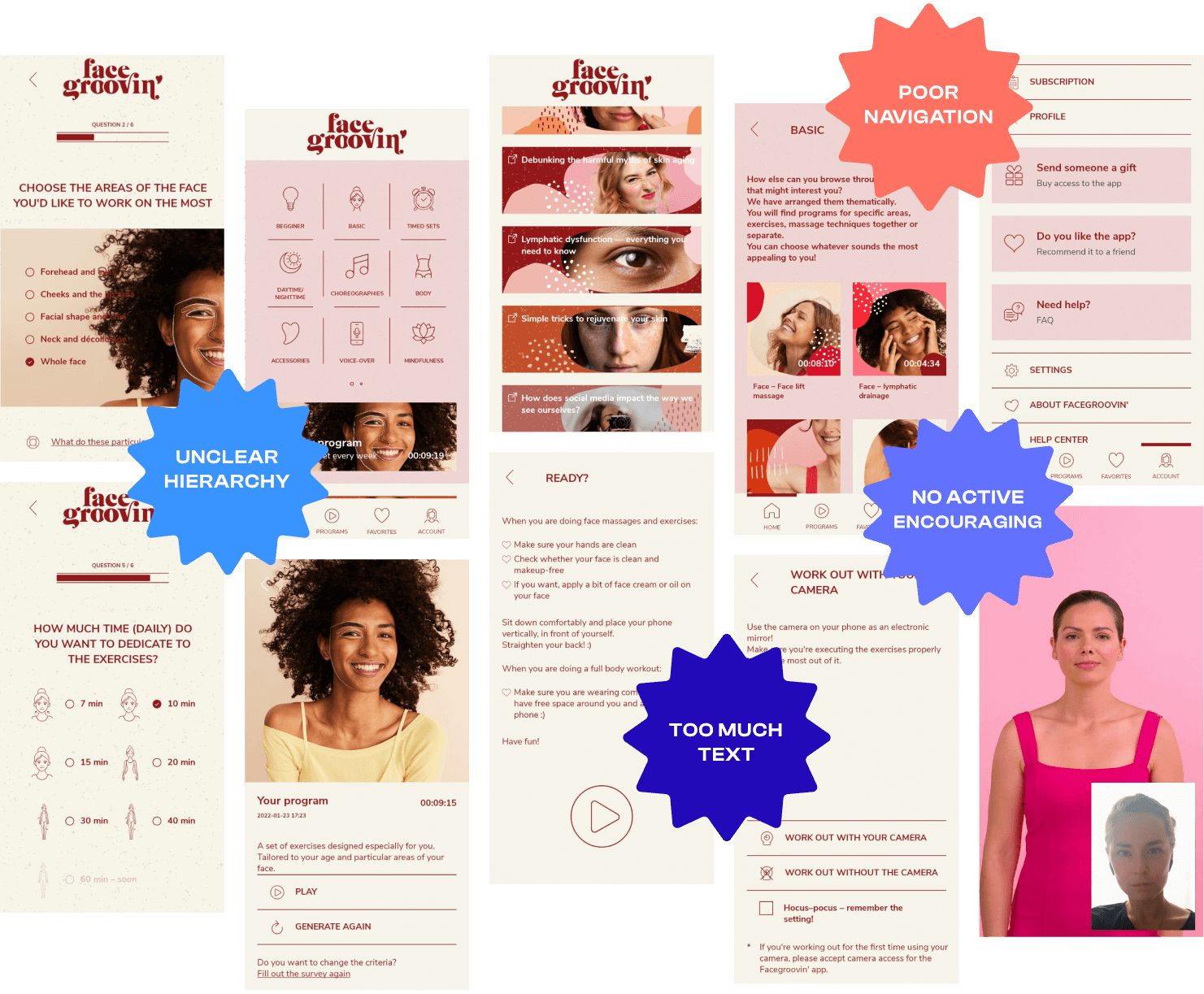
Facegroovin' app has a positive vibe, which mainly comes from the photos and
massage videos. However, the app needs a major face lift.
Below you can see a few issues that caught my attention.
I've decided to approach redesign holistically and started with user interviews.

project in numbers
process

Interviews
Based on the target audience, I've conducted six 20-min interviews. My goal was to understand goals, needs, fears and motivations of app users.
participants' overview
What participants have in common


Usability testing
After the interviews, I've continued to the usability testing for an existing app. My goal was to understand what feelings current design awakes and to see, what questions arise when first-time users perform simple tasks, like trying a massage and finding the answers for their questions.
here is a map of user's emotions and their direct quotes


Survey! Let's see, what program will I get! 🤓

Wait. Why can't I choose more that 1 area for improvement? What about my chin? [-100]

Oh, now we have images...and they don't make any sence. Why Dry and Sensitive skin look the same? [-50]

Ok, done! I'm ready for professional advice! Oh, there is the program! Wait, why is there just 1 session?! [-200]

Ok, FAQ section should help me to understand it. But first I just need to find it... Why is FAQ in my account? Account is for my data and stats! [-100]

No answer that I'm looking for. And no search! Do I have to scroll through?! [-100]

Let's see what session do they offer me. Need to relax ASAP! Ok, ready, play! Video is nice! [+100]

But what with the music? Can I change it to something relaxing? I know, I've chosen happy in survey, but I'm not in the mood for the pop now. [-200]
Main issues

Onboarding-questionary have created false expectations for a clearly defined individual program.

At the same time Survey raised some confusion – participants “downloaded” app for a facial massage but suddenly without an introduction to the Facegroovin' concept they are asked if they want to have a 40 min body training.

Regarding personal program – only one participant saw it right away, the others got heavily destructed with nine(!) categories at the top of the home screen. The reason is simple: there is no clear hierarchy.

From the 9 available groups participants were interested only in 4 (basic, timed sets, day/night and accessories). Other 5 categories just created noise and distruction.

Colors and amount of text kept users tense. Too much text. The font size is too small. Color contrast does not meet accessibility standards.

Navigation is frustrating: FAQ section is located in the Account. Only 1 participant thought of looking for it there. Due to the general expectation – account is there for personal information and user's progress only.
Personas
Interviews and testings allowed me to understand potential users better. Now when I knew their thoughts on the topic, saw their emotions and learned their fears and wants – I was ready to create personas.


User stories


information architecture
Stories helped me to put myself in shoes of each user group and to build the information architecture of the app. My goal was to provide information timely and to allow users to understand the value of the product before they commit to a subscription or even a free trial.

Wirefeames
User stories were used as a benchmark for the wireframe tasting. I've
compared created user stories to the actual user journeys.
To be
honest, I was quite surprised: participants did opposite to what I've
expected! Older generation started to explore, while younger users
preferred to see first, what kind of the program would they get.


